Have you ever spoken to someone on your dev team about their job and immediately regretted it as you wonder what they’re talking about? Us too. Every. Single. Time. Luckily our very own Alex Tonkins put together a presentation explaining some of the processes of web development, and what your devs are up to when they’re doing whatever it is that they’re doing, in an attempt to break down the barriers between web devs and regular humans. This blog is a translation of that presentation for all of you regular folk.
Design
A design is an absolute must before beginning development – you wouldn’t try and cook a meal without knowing what was in it. This is the same concept. A design provides clients with a glimpse into how their website will look and feel, helping them see the final product before development begins. Clients can review the design concepts, provide feedback, and suggest changes or improvements based on their preferences – slowly resulting in the final product. Going back and forth to identify and finalise a design may seem long winded, but in the long run it reduces the likelihood of costly reworks later down the line, for both client and agency.
The designs themselves are not made by the devs, however, they are reviewed by the devs and the final iteration of the design will need to be okay’d by them to make sure that it’s doable. Alex says it is far easier and more cost effective to make a load of designs than it is to make a load of iterations of a webpage so it’s very important that the final design is also approved and signed off on by the client before any development takes place. Makes sense. Good job, Tonkins.
Clients aren’t the only ones that benefit from these designs, though. Having the designs created as digital files that contain colours, font sizes, elements, and anything else, means that all of these things are easily accessible to the devs, allowing them to open the file and grab anything they need.
Development
Approvals
The first steps of the development stage come after all of the approvals; approval from the client, that they are pleased with the design, and approval from the devs, that all functionality has been scoped and is accounted for, and that the design will work from a web point of view. This step is very important, as something that may seem ‘easy’ to implement may end up adding another handful of hours onto the project. Any dev will be able to tell you a story about a time they had to implement a painfully insignificant bit of design that ended up taking them days to complete. It’s about finding the right balance between design and development, that’s why these steps are so important.
Core styles
Core styles are the backbone of every project, and shape the appearance and layout of a website. Adding these at the beginning of the build of a project will allow the site to take shape before doing anything too major. If the previous steps have been followed, then adding these styles should be super easy because you can just refer back to the designs (the ones you saved in the files).
Core styles include elements such as:
- Fonts
- Copy Sizes
- Colours
- Buttons
- Spacing
These elements are some of the most crucial as they’ll be used on almost every page of the site. When a developer then moves onto creating any other parts of the design, most of the content will look great straight out of the box. They’ll then only need to focus on creating the new functionality, whilst making use of the core styles that have already been setup.
Alex’s top web dev tip:
Always scan through designs for any elements that look or function similarly to each other.
Alex says he does this so he doesn’t begin developing something specific to one area that might also be used in another area. Repetitive elements aren’t always obvious but, in the long run, it’s worth taking the time to identify all of them as it saves a lot of time and unnecessary code. What a clever dev!
The block approach
At Noble, our devs, Andy and Alex, use WordPress. WordPress updates over the past couple of years have been slowly pushing it towards a block-centered way of building. This effectively means that developers create blocks to house functionality, depending on what is required, and then the rest of us can drag and drop said blocks to make changes to pages. Each block is completely unique and separate from the others, giving the admin of the site near total control over how they’d like the site to look.
A key question that web devs are constantly asking themselves is ‘what if…?’.
“What if the client doesn’t have an image for that area?”
“What if the content added is too much for the space designed?”
“What if the colour the client chooses clashes with the background?”
Devs have to build functionality whilst bearing in mind that the client will ultimately be the one who will be using it. So keeping an open mind whilst building each bit of the project can save a tonne of time later on down the line. Imagine a client comes back to request an update to a bit of functionality but, hey, it’s already been implemented! Feels good right? Probably. I’m not a dev so I have no idea.
Mobile first
A mobile first approach should be an integral part of any web project. Over the years Web Traffic has flipped, with Mobile now being used more than Desktop. There isn’t any data to indicate that Desktop will take over again any time soon, so a mobile-first approach needs to be at the forefront of both design and development.
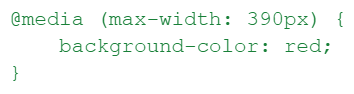
In order to implement a mobile first approach, Alex and Andy use CSS Media Queries. What are CSS Media Queries? I have no idea. But according to Alex it lets you change the style of a website at different viewports. For example, you can make the background of a page blue for desktop and red for mobile. The way this works is by using breakpoints.
A breakpoint is the exact point at which a media query should kick in. Say, for instance, an iPhone is 390 pixels wide, the media query will say something to the effect of ‘if the width is 450 pixels or less, then make the background red’. For those of you, unlike myself, who don’t need this concept dumbed down, it should look something like this:
Other browsers exist sometimes
Another thing that devs have to be aware of, is ensuring that all of their code is compatible with many different browsers.
Just because you don’t think of or care about them, doesn’t mean they don’t exist.
The most commonly used browsers tend to be:
- Chrome
- Firefox
- Safari
- Edge
There are often instances where something may look great in one browser, but when it’s tested on another the devs can see that something they’ve used is unsupported. This is what is known as a ‘boo boo’. Boo boos cost time and money. Don’t make boo boos. Boo boos are bad.
Deployment
Alex says that deployments are not fun. And he’s a web dev. Let that sink in. Now that we’ve established that deployments aren’t fun, it’s time to establish what a deployment actually is. In short, it means the devs will be moving all of the files that have been changed to accommodate the new functionality onto either a Staging or Live site. Actioning a deployment is often different each time. It’s a case-by-case activity that depends on exactly what has changed within the files / codebase. Deployments are totally dependent on the way that the site has been built and set up. Alex says that in an ideal world you’d have every site on a similar system, so you’d action a change, press a button, and ‘bosh, deployed’. Alex says ‘bosh’ a lot.
Regardless of what Alex and other devs would like the case to be, this is the real world; factors such as pricing, security, what powers the site, and many more, mean that it is almost never that simple. For example, we had a client with a tonne of security which required a specific VPN and login credentials in order to access the site. Another client of ours had multiple sites using the same code-base, meaning that Andy and Alex immediately had to account for deploying and testing each one. See? Case-by-case. But the one thing that remains consistent is the fact that deployments are not fun.
The end
Well, that’s about it. We’ve covered Alex’s presentation. Hopefully you learned something and don’t need this, but just in case, these are some of the main takeaways you should have gotten from this blog.
- Devs should be allowed to talk to clients sometimes
- Google Chrome is not the only browser in existence
- Don’t make boo boos
- Deployments are not fun
- Give your developers a pat on the back for all the hard work they do. Good job devs. We love ya.